Responsive Web Sites

Responsive Web Design is a term coined in 2010 by Ethan Marcotte. It is an approach which states that the design and development of a website should respond to a user’s behavior and environment, based on screen size, platform and orientation. The methodology consists of a mix of flexible grids and layouts, images and the intelligent use of CSS media queries.
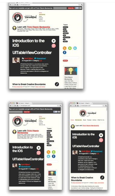
Examples of Website with Responsiveness
Source: https://blog.teamtreehouse.com
A website opened in browser, tablet and mobile views; content is not diminished or reduced based on device. While re-sizing the window, content is wrapped down and displayed horizontally.
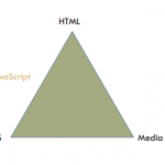
Technology behind responsive websites

Let’s examine each technology
Fluid Grid layout: To manage pixel coordinates in a layout in the web design. It helps to place content in the web pages sequentially.
HTML: A mark-up language to integrate the responsive coding to form a single file, which helps to combine media query, CSS and Java script. HTML tags gets defined meaning and purpose. Standard HTML tags are introduced from version 4.
Media Query: Helps to display the website, based on the device selected to open the website on. The web content is thus adapted for the device selected, example tablets or mobile phones. Helps to display custom style sheets for various devices.
CSS: CSS integrates media query in web page, either internally or externally, to inform the website to open the content based on the device. CSS has various style elements and attributes to contribute to the web design for responsiveness. Without CSS, the whole concept of responsiveness will not be achieved.
Java Script: A scripting language which has pre-defined libraries to create programmed scripts for certain tasks in a web site.
How to develop responsive websites?
We may use software tools such as Dream weaver, Visio . Net, Net beans or simply text editors to develop responsive web sites. HTML and CSS standards are adaptable by any devices, including browsers.
Without all these blend of technologies, responsive web sites may not be possible. We must appreciate device manufacturers, such as Samsung, Apple and HTC, for their use of responsiveness in their devices and for boosting device sales. The future of web development depends on responsive sites using the technologies discussed.
Authored by Latha Manian – School of Technology


